In short
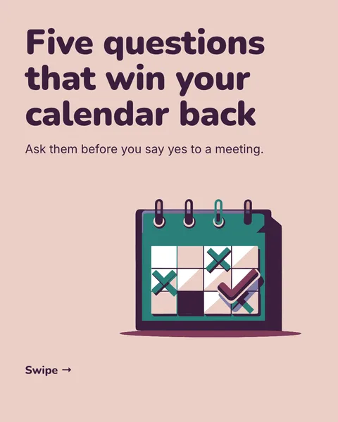
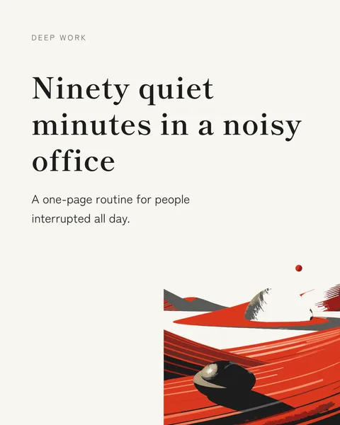
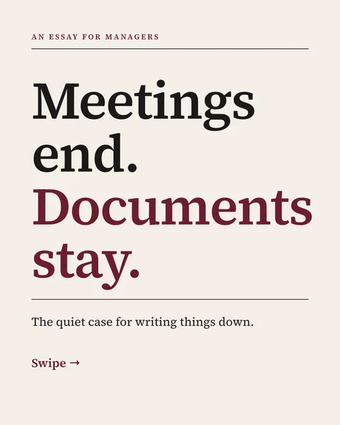
A carousel is the picture, and the caption is the text above it. Together they decide whether the post gets read. The caption does not need to repeat the slides. It has to give a reason to open them.
A structure for the caption
- A first line that stands alone. On LinkedIn only the beginning of a long post is visible before the reader taps to expand, so the first line carries the weight.
- One or two lines of context the slides leave out: why you made it, who it is for, or what happened.
- A pointer: "Swipe for the 5 steps."
- One honest question, or a reason to save it.
What to leave out
- A copy of the cover headline. The reader has just seen it.
- Engagement bait such as "comment YES for the template". LinkedIn says it shows posts like these to fewer people.
- A long list of hashtags. A few relevant ones are enough.
- A link to your website crammed into the post. If you need one, put it in the first comment.
On Instagram the caption sits under the images. It can be longer, and the first line is still the one shown in the feed. See how to post on Instagram.
Write it yourself
carouselgen designs the slides. The caption should sound like you, so write it by hand. Use the last slide for the takeaway and the caption for the invitation to swipe.
Questions
Where does the title of a LinkedIn document go?
LinkedIn asks for a title when you upload a PDF. It shows with the document, so make it say what the carousel is.
Should the caption have a call to action?
One, and a real one. A question the reader can answer from their own experience is better than a command.
How long should it be?
Two to five lines is enough for most carousels. The slides carry the content.
Make this carousel now
Describe it once. The designer lays out every slide, and you fix what you dislike by commenting.
Try for free nowNo sign-up needed to try. The free plan exports with a small carouselgen.com mark.