In short
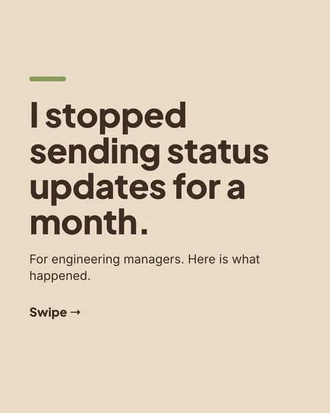
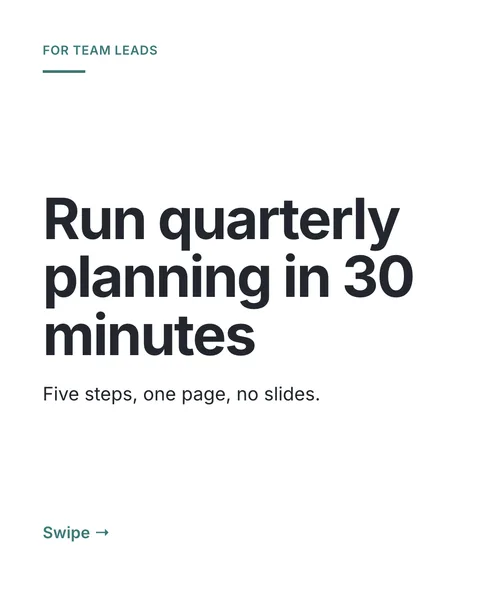
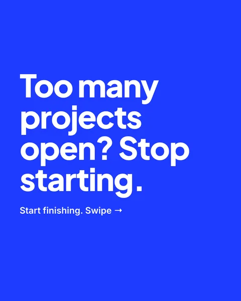
AI carousels used to look alike. A count of the first 145 finished carousels found 35 font families in total, and a single serif in more than a third of them. So the designer now asks for a design before it writes a word, from a library of 22 looks.
The 22 looks
- Ma, meaningful emptiness
- Poster geometry
- Indigo and paper
- Playful geometric
- Temple colour accents
- Swiss grid
- Scandinavian calm
- Bauhaus primary
- Tropical modern
- Magazine editorial
- Neo-brutalist accents
- Bento grid
- Dark with one signal
- Hand-made and imperfect
- Data forward
- Terminal and code
- Warm seventies
- Blueprint
- Audit document
- Luxe contrast
- Playful confetti
- Soft pastel
Each look has a palette whose contrast has been checked, fonts from the Google catalogue, a layout, motifs and a slide rhythm, and a list of what to avoid. The looks come from design principles with a named origin, such as the Swiss grid, Bauhaus or the Japanese idea of ma (empty space), not from a culture's sacred or decorative symbols.
How the designer picks
- It asks for one or two looks that suit your topic and audience.
- It is also told which fonts your last five carousels used and which are common across the site lately, to avoid them.
- It gets one wildcard look from outside its pick, and one layout rule chosen by a dice seeded on your carousel.
- It is told that the pack is a starting point: your brief, a template, a logo, a website's look and your comments rank higher.
Steer it
- Name a look in the brief: "Swiss grid" or "bento".
- Name colours and fonts to fix them: the designer then follows you.
- Use a template or a brand if you want the same look every time. The design library is then not offered.
Nobody has run a blind test of carousels with and without this library yet, so there is no number for how much better they perform. The aim is variety and a look that suits the topic.
Questions
Will two carousels from the same brief look the same?
Not necessarily. Unless a brand, template, colours or fonts fix the look, the designer may choose different looks each time.
Can I see which look it chose?
Not in the editor. You can ask in the brief for a look by name, and say what you want to keep after the first draft.
Is a look the same as a template?
No. A look is a starting point the designer draws on. A template is one of your own carousels, and the new one follows its slide styles closely.
Try it on your own carousel
Make a carousel from a short brief, then use this feature on it. It takes about a minute to get the first draft.
Try for free nowNo sign-up needed to try. The free plan exports with a small carouselgen.com mark.