In short
These are rules of thumb we use when designing carousels. They come from how a slide behaves on a phone, not from a study, so test them on your own audience.
1. Design for the phone
Most people read carousels on a small screen. A slide that looks fine on your monitor may need pinching on a phone. Check it at thumbnail size before you export.
2. Use big text
On a 1080 pixel wide slide we keep body text at 30 pixels or more and headlines at 64 or more. Small labels stay at 22 or above. If you need more words, split the slide.
3. Keep one idea per slide
A slide that makes two points makes neither. If you can say the slide in one sentence, it is done. If you need "and", it is two slides.
4. Leave margins
We keep at least 72 pixels on every side. The feed and the app interface crop and overlay edges, and text near the border looks cramped.
5. Check the contrast
WCAG's AA level asks for a contrast ratio of at least 4.5 to 1 for normal text. Light grey on white fails it, and so do many accent colours on coloured backgrounds. Use a contrast checker on your two main pairs.
6. Limit fonts and colours
Two fonts and a palette of three to five colours is plenty. Use the same ones on every slide, so the deck reads as one thing.
7. Make the cover a thumbnail
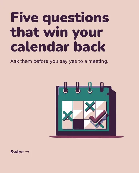
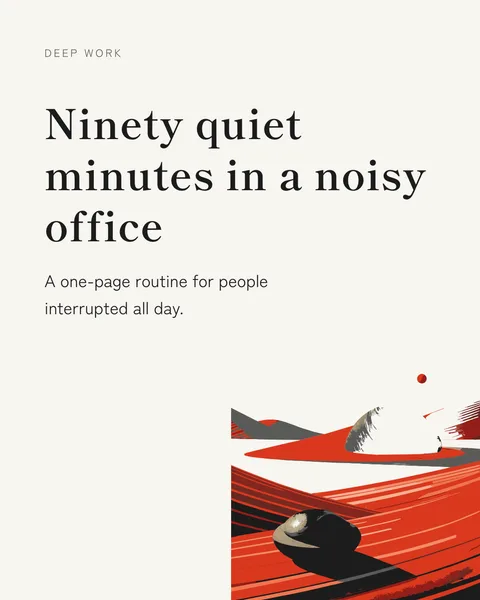
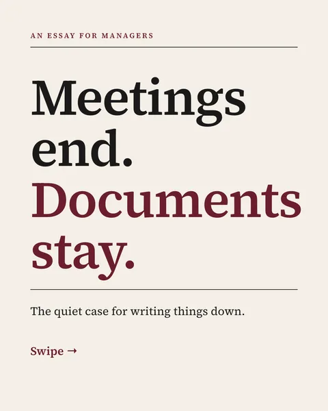
The cover shows in the feed before anyone swipes. One idea in about ten words, large, with space around it. See the cover examples.
8. Mind the seam
If a shape continues across two slides, keep text and faces away from the edge. A visible gap appears between slides when someone swipes.
9. End with one action
The last slide asks for one thing: follow, save, comment or visit. Two requests split the response.
Let the designer apply them
carouselgen's designer follows rules like these by default, and you can switch the LinkedIn guidelines on or off before you generate. Its look still changes every time, because it picks the colours and fonts for the topic.
Questions
What font size should a carousel use?
On a 1080 pixel wide slide, at least 30 pixels for body text and 64 for headlines is a safe starting point. These are our own guidelines, not LinkedIn's.
How many colours should a carousel have?
Three to five, used the same way on every slide.
Make this carousel now
Describe it once. The designer lays out every slide, and you fix what you dislike by commenting.
Try for free nowNo sign-up needed to try. The free plan exports with a small carouselgen.com mark.