In short
These are first slides from decks that carouselgen designed, each from a short brief. The look is different every time, because the designer chooses the colours, fonts and layout for the topic. We show only covers here, because the cover decides whether anyone swipes.

Bold: one statement, huge type, one colour. 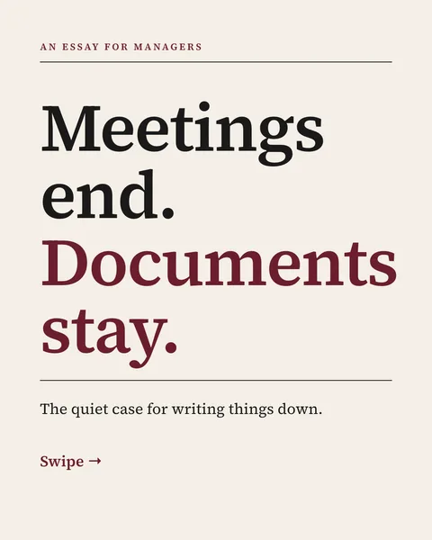
Editorial: serif headline, thin rules, one accent. 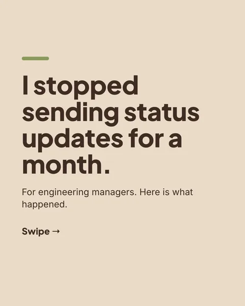
Personal: first person, warm and plain. 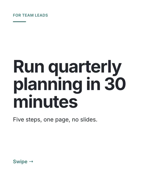
Professional: a clear promise and nothing else. 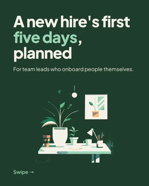
Forest: a picture that fits the subject. 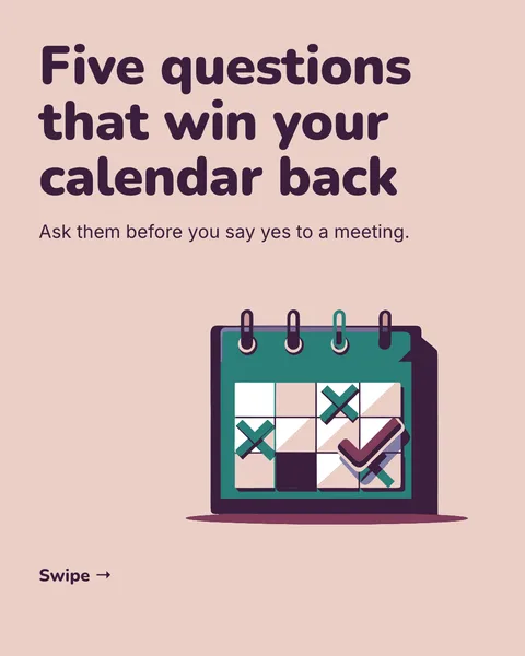
Plum: a playful picture, large readable text. 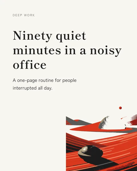
Zen: lots of space, a single image. 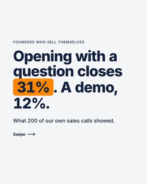
Data: the number first. These figures are sample text for the demo, not real data.
What the covers have in common
- One idea, in about ten words. You can read it in a second.
- The headline is the biggest thing on the slide, by far.
- A small line says who it is for or what they get.
- A swipe cue at the bottom. It tells people there is more.
- Plenty of empty space, so it works as a thumbnail.
What to copy
- Write the promise as a sentence a stranger would repeat.
- Say the audience in the small line: "For team leads" tells the right people to stay.
- Pick a look that matches the subject. A calm essay should not look like an ad.
- Use a picture only when it says something. The desk and the calendar do. A random stock photo does not.
Make one like these
Describe your topic and who it is for, and the designer picks the look. You can also name colours, fonts or a mood in the brief. The inside slides follow the same style. For slide-by-slide structures, see 10 LinkedIn carousel structures.
Questions
What makes a good LinkedIn carousel cover?
A single clear promise in large type, a line saying who it is for, and enough space that it reads as a thumbnail. The cover only has to earn the swipe.
Are these real carouselgen carousels?
Yes, they are the first slides of decks designed by carouselgen from short briefs. The numbers on the data cover are sample text.
Make this carousel now
Describe it once. The designer lays out every slide, and you fix what you dislike by commenting.
Try for free nowNo sign-up needed to try. The free plan exports with a small carouselgen.com mark.